Friday, 27 April 2012

Button Design


So here we have the webbings for my button design. I had to choose between either some music references, online references, 90's sayings, or just pictures of my cat.


Here's the thumbnails! Top left and center are band logos, top right is a reference to The Breakfast Club, Next row is some lyrics, Socially Awkward Peinguin Meme, and the famous 90's saying; "Talk to the Hand!". The next row has Eminem with a reference to his song "Superman", Dwight Schrute from The Office, and my cat, because he's absolutely adorable. Then we have the Reddit avitar, because I'm an avid Redditor.


But for the final good copy, I decided to go with the logo from Tokio Hotel. I'm a huge fan, so what better way to show it than with a button?

If I could make another button, I'd do one of my cat. I love cats. Especially mine. It was hard to do the thumbnails a bit because of the lack of the template. I most enjoyed getting the freedom to do whichever button was suited to our pleasing.

Friday, 13 April 2012

T-Shirt Design


Here we have my webbings for my shirt. I did have one more idea not included, but I'm completely satisfied with my choice for the final copy. A picture will later be posted of the completed shirt.


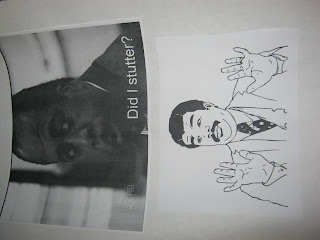
Here's my thumbnails. I did a mix of the top left hand thumbnail, and the bottom right hand. The two combined makes me extremely happy.


And here we have the rough copy! Stanley Hudson from The Office mixes with a meme. They resemble each other slightly, so I decided to mix the two of them together. The line "Did I stutter?" comes from a memorable moment on the office.


This is the design which will be on my shirt. I changed the picture of Stanley for it! I enjoyed making a reference to The Office, and next time, I'd figure out what to do with Photoshop, maybe get a colour background.

Wednesday, 21 March 2012

Soda Label


We have the webbings here for my soda label. I had too many ideas to choose from, but I decided to go with a Japanese manga.


These are the thumbnails. Now for the thumbnails, I hadn't fully decided what to do with the rough copy. But, in the rough copy, you can see the idea come to life.


And here's the rough copy. Since Naruto is into ramen quite heavily, why not do a soda depicting his favourite food? Mm, cold noodle juice.


And here we have the good copy. Introducting, Konoha Co. Soda! This company makes a variety of Asian flavoured sodas. From the quite flamboyant taste of the animated names, or that of this ramen soda.

I definitely had fun making a soda label for Naruto. I'm a huge fan of the manga. If I could improve it, I would have had more Japanese characters included in it, and maybe a different font. I did have a bit of trouble choosing the colour scheme for the background, but after remembering what colours seem to appear in the anime, I decided on an orange, green, yellow scheme.
For next time, I might try doing a different manga!

Tuesday, 13 March 2012

Magazine Cover


Alright. Here we have my webbing. I was stuck between a magazine illustrating the violent lifestyle of the fictional gang of the Third Street Saints, a magazine about legendary music acts and one about snowboarding.

This is my first thumbnail page. I experimented a bit with different ideas, because I had not yet settled on one.


Here is my second thumbnail page. As you can see, I was a bit hesitant with these so I rushed a tad. Thankfully, I went with one of the ideas from the first thumbnail page.


Here's my rough copy. Hastily drawn, the computer version turned out much better than expected.


And here's the final copy. It took much effort to crop out the band members out from a selected picture. It also required patience.

I enjoyed doing a magazine cover on Blink-182 due to my enjoyment gained from listening to their music. One thing I wasn't too fond of was the lack of animation and shading. I think it would have looked better if there had been such. Next time if I do a magazine cover, I would try and experiment with animating the title, and subtitles.

Tuesday, 28 February 2012

Custom Font (name) and Qualities


This is the webbing for my font. I decided to web out certain qualities that define me.


Here we have both pages of my thumbnails. I toyed with the idea of writing my name in Japanese for the permanent font, but then decided on regular printing because I highly doubt that anyone here can read Japanese.


And here we have the rough copy. Since I'm an avid reader, I decided to make my name quite intellectual.


And the finished project of my name. Tada! I once again used Adobe Illustrator. I prefer it for freehand computer art to that of Photoshop

And here is some qualities of me. For shy, I used a computer resembling pixelated font, since pixels are usually hard to interpret. Clever was written in cursive, and intellectual was written in a better pixelated font.

This assignment challenged my creative senses. I had to dig deeper into myself to discover a suitable font. I liked all the ideas I came up with. I wasn't too fond of having to choose just one. If I do this again, I would make the font probably with 3D animation. I think that would look much more sharp.

Monday, 20 February 2012

Logo Design (and process)


This here is the webbing for my logo. I was debating between a website promoting moustaches and a skateboard company. Guess which one I went with?


This is the first page of my thumbnails. Playing around with various scenarios, etc.


This is the second page of the thumbnails. Unfortunately, I was unable to rotate them. Hence the awkward sideways uploads.


And this is the rough draft. Remember, there was the unfortunate situation of not being able to rotate the picture.


And here's the final copy! I stumbled upon Adobe Illustrator, and this hopefully turned out alright.


I liked choosing a company. Since I did a skateboard one, I thought it should be one with the slogan of immortality, since it takes a lot of perserverance to stick with it. The logo blends unlucky with lucky.
I wasn't too fond of the processing, since usually I only have one idea that I like to build off of. But hopefully this broadened my horizons on the whole set-up.

Tuesday, 14 February 2012

Perspective Line Drawing


Roger Waters is here. In the flesh. But sadly, not up against the wall.
What I liked about this project? I liked that I could choose an actual person, rather than a shape. I didn't like the amount of patience it required. For next time, if anything, I would choose to shade a bit differently.